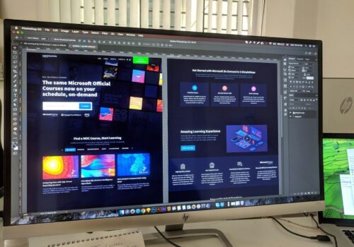
11 tips to help create the perfect website interface in 2021
The User Interface is an important component of any website or application. The target audience’s experience depends on how well it is designed.
We’ve gathered 11 tips to help you design an interface that solves users’ problems.
Pay attention to your audience’s needs.
Graphic design – a subtle art where there is no limit to perfection. You don’t have to have 10 years of Photoshop experience to make a cool project.
To successfully translate an idea into a tangible UI, you need to be part of your target audience for a while. For example, the client is a large bank that has launched a new credit card and wants to develop an app for it. The people in charge find a designer, set a task, and wait for the result.
90% of designers take the following route:
- They remember what software they’ve used.
- Look at examples of interfaces on popular resources like Dribbble, Behance, Awwards.
- Make some Wireframes in the service or draw a “skeleton” by hand.
- Approve the sketches.
- Move on to the implementation of the “cleanse”.
Only 10% realize that they need to analyze the needs of potential customers. A small percentage of designers become credit card holders or animal lovers for a while. Even if they only use electronic money and don’t like pets.
This quality distinguishes professional professionals from those who are used to simply solving a problem and hoping that customers will appreciate their concept. It is important to understand that a website or mobile application does not end with a layout in a graphic editor. Next comes the developer, who transforms the picture into a “live” interface. The only thing that depends on him is the speed of the project. What is important for users is convenience – the designer is responsible for this criterion.

Analyze your competitors
Competitor analysis helps to identify advantages and disadvantages. This information will come in handy for creating a convenient solution, which in time can replace the existing analogues.
There is an opinion that everything new is well forgotten old and nothing can be invented anymore. Any graphic project consists of the compilation of previous experience. There is some truth in that. The basic components and methods of work have already been invented. New tools like online graphics editors appear, but any UI is a set of standard elements. All that remains is to properly place them on the canvas and justify the structure.
Use prototyping tools
In the last article we talked about the almost unknown concept of wireframe. It is a black-and-white sketch of the future UI. We won’t tell you again about the importance of creating drafts. There are plenty of arguments in the material at the link above. Let’s just say that an additional prototype won’t be superfluous.
If you’re used to drawing a layout on a piece of paper, there’s no need to change your habits. Just try to run Figma or MockFlow once. These tools “understand” the designer’s tasks without unnecessary words. The developers have automated most of the routine processes. In “Photoshop” you would have to constantly copy layers, align grids, measure distances manually.
Take time for typography
Designers often get hung up on creative gimmicks and forget about the basic components. Fonts, header size, layout style, underlines, and other attributes affect the user experience. Formatting affects the user experience.
Imagine that after installing an application you need to create an account, but the form fields are too small and you can’t get into the selected area the first time. It seems that such examples belong only in UX textbooks, but they exist in real life. Forms without validation, half-screen lists, fonts without Cyrillic support – these are just some of the popular mistakes.


